The first of three simple-to-implement design principles to help brands and retailers grow online sales revenues.
Principle One: Visibility & clarity.
Packaging design has long been focused on 'on-shelf standout'. But with more consumers shifting to online shopping since 2020, packaging design isn't just about standing out from the competition anymore but also capturing and retaining the short attention span of the online consumer.
There are a few golden rules to follow to stand your brand in good stead when selling online.
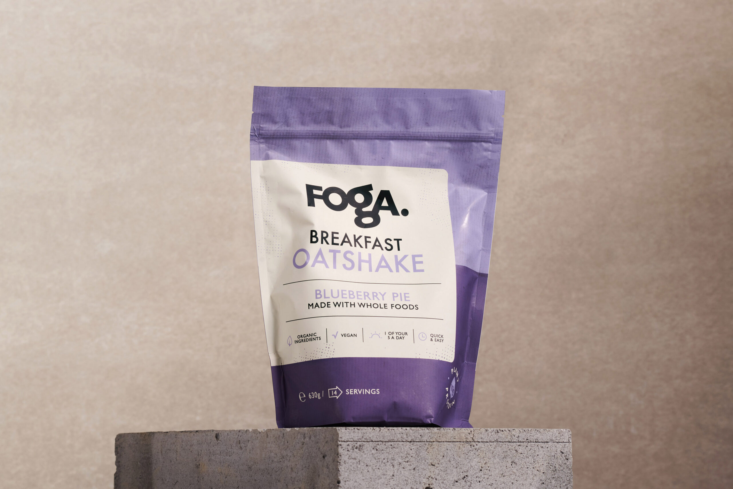
01. Product images are likely to be much smaller than the actual size of the product. Sounds obvious, but it’s mindblowing how even some of the more prominent brands don’t account for this. In essence, when consumers buy brands within a physical retail environment, they can make out finer detail and text due to the scale in front of them. When sales shift online, it's common to see a drop in revenue because consumers simply can't recognise the packaging anymore. For example, brands should be mindful of denoting different pack sizes clearly on the front of the pack to avoid consumer disappointment when an unexpectedly tiny (or huge) version of their favourite product arrives in their weekly shop.
02. The front of the pack needs to work the hardest it ever has. Of course, in-store, consumers can also pick up the product and turn it to see the finer product detail on the other sides of the pack. To alleviate this, when moving the focus to online sales, the front of the pack design needs to be as clean, clear and straightforward as possible. Well-established brands can distil their brand design down to the core qualities that the consumer recognises. Smaller brands can take the risk and let product description, or name, have the top hierarchy, followed by the brand itself.
03. Adjusting for the consumer mindset’s shift to health-consciousness. But there is a complication with simplifying the pack: 2020 also witnessed a mass change in consumers' attitude towards health-consciousness. So, whilst we are firmly in favour of decluttering the pack, it's also crucial to avoid making the front of the pack look so stripped back to seem 'artificial'. It’s a delicate balance, and a capable, experienced brand design partner can help you find the right balance.
04. How do you denote different ranges? Finally, if the brand has a broader portfolio than a single SKU, it's more important now than ever before to make it as easy to navigate the range as possible. Use the time-old tools of colour and other visual cues to drive recognition of different variants so that consumers can shop their favourites with ease.
Ps. Want to activate this advice for your brand? Book a free consultation to discuss your brand future.
Back